

If you’ve ever dropped a standard black-and-white QR code into a nicely designed room, a printed poster, or a branded menu, you know how fast it ruins the visual flow. They work fine for grabbing a link, but aesthetically, they’re a harsh, pixelated block that destroys any cohesive vibe.
That is why people started making custom photo QR codes—blending images, soft backgrounds, and brand palettes right into the code so they can build a custom photo QR code that actually fits their space.
The catch is that what looks completely fine on a bright phone screen while you’re editing often fails the second it gets printed on physical paper or exposed to dim room lighting. A version that scanned reliably on a phone screen became inconsistent after printing on glossy paper because reflections reduced the apparent contrast. To make a custom photo QR code work in the real world, you have to balance visual design with core scanning mechanics.
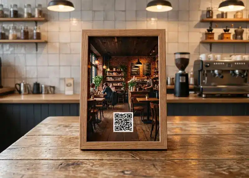
Why Regular QR Codes Look Awful in Real Spaces
Styling a physical environment—whether it’s a minimalist home office, a boutique coffee shop, a gallery wall, or a product display—relies heavily on lighting, textures, framing, and color tones working together. Dropping a stark, high-contrast digital square onto that surface creates immediate visual friction.
Using a creator tool lets you weave the code into an underlying photograph, soften it with a subtle blur, or tint the data dots to match your brand. Done right, the code almost hides in plain sight instead of acting like a jarring tech marker.
The Technical Reality: How QR Codes Handle Design
You can’t just throw a transparent photo over a QR code and expect it to work. Understanding why some custom codes scan smoothly while others fail comes down to three main structural factors.
Finder Patterns and Orientation
Those three large squares in the corners of a QR code help a smartphone camera quickly orient the code and calculate the angle of the scan. While a slight design overlay or subtle pattern integration near these corners might still scan under ideal conditions, heavy visual clutter or overlapping elements in this zone can significantly lower recognition rates or cause scanning failures. Keeping the core orientation areas as clear as possible prevents unnecessary read errors.
Error Correction: How Much Can You Change?
QR codes have built-in redundancy known as error correction, which mathematically allows a percentage of the code to be covered or modified while remaining readable. However, this is an engineering safety net, not a license to wreck the design. Slapping a heavy, opaque photo right over the data grid quickly overwhelms the error correction threshold and breaks the code entirely.
The Quiet Zone
People printing custom QR codes often crowd them right up against picture frames, border designs, or busy background edges. Every QR code requires a clean, empty margin of space around its outer perimeter—known as the quiet zone. If a phone camera cannot isolate the outer boundary of the code from surrounding visual noise, it fails to lock on.
Designing for Real-World Conditions
A custom QR code that scans instantly on a bright iPhone screen behaves very differently once it meets physical mediums like matte or glossy paper, or a dim room with angled lighting.
Mixing background photos with data dots often creates contrast issues where the camera loses the edge density needed to read the data. Applying a soft blur to the background photo helps separate the foreground pattern from the visual noise behind it. If the image remains too complex, manually adjusting the QR code module colors so they contrast as sharply as possible against the background saves the design.
Beyond contrast, print quality also affects scanning reliability. Setting the output resolution to high-resolution mode before exporting or printing can help keep the individual modules crisp and defined, preventing pixel bleed or jagged edges that ruin recognition rates on physical paper.
Building Your Custom Code
QR Code Generator
Select a type and enter your details
Please verify the QR code actually works before using it.
The tool below lets you experiment with background blur, color contrast, and image placement before exporting a printable code.
Using a flexible generator gives you control over more than just a basic web link, allowing you to configure your code to trigger phone calls, email drafts, digital vCards, or document downloads. Upload your background photo, apply a gentle blur to keep the background from competing with the code, adjust transparency levels so the underlying picture remains visible without muddying the contrast, and soften the dot shapes to match your aesthetic.
Before committing to printing or mounting anything, test the design across multiple real-world scenarios. Pull out more than one phone brand, test it at different viewing distances and angles, and check how it handles varying lighting conditions.